
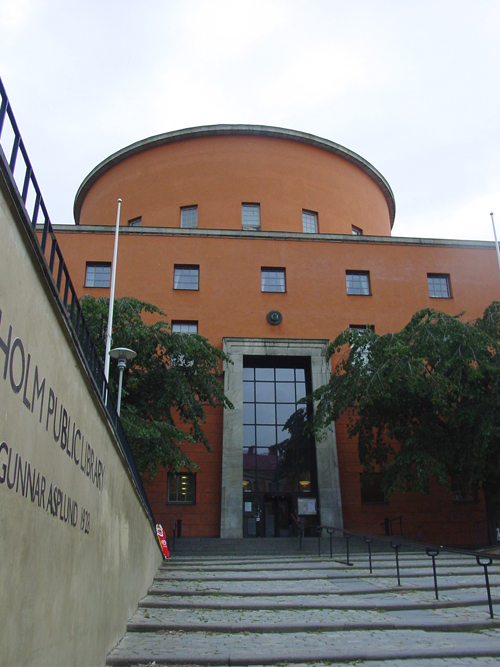
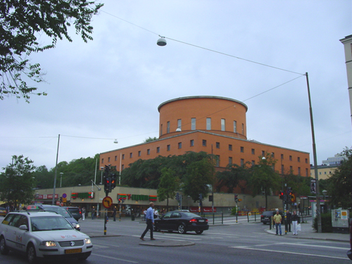
It is difficult to get a new angle on this classic building. The biggest surprise, to me, is its aloofness – the building stands back four-square, the main approach to the entrance obscured by commercial structures along the street. This must be intentional as the base formed by shops and restaurants was part of Asplund’s scheme. His original drawing shows a commercial terrace with clean lines and elegant typography. He cannot have dreamed of the signage inflicted upon the scene by McDonalds. As the axial entrance appears and you climb towards the building you are drawn into an introverted cylinder of books at the centre of an architectural mountain complementary to the adjacent hill.
Posted from Mariefred, Sweden
Pingback: CONTINUITY IN ARCHITECTURE » Blog Archive » Stockholm Library Competition